Thursday, February 28, 2013
Friday, February 22, 2013
Project 2 edits, Sarah Bowthorpe
I've made some edits to this--adding lines to the tortoise's shell and making the transitions between the rows smoother.
Wednesday, February 20, 2013
Project 3, James Gardner
hana lee
hello, i woke up like just now....0_0
i will b rite there sooooooooon!
btw, my project3 is my website. i've been working on building it and getting my email set up, which i should've done earlier. took me forever to come to this point over this wknd. here is the link: soljeelee.com
i will b rite there sooooooooon!
btw, my project3 is my website. i've been working on building it and getting my email set up, which i should've done earlier. took me forever to come to this point over this wknd. here is the link: soljeelee.com
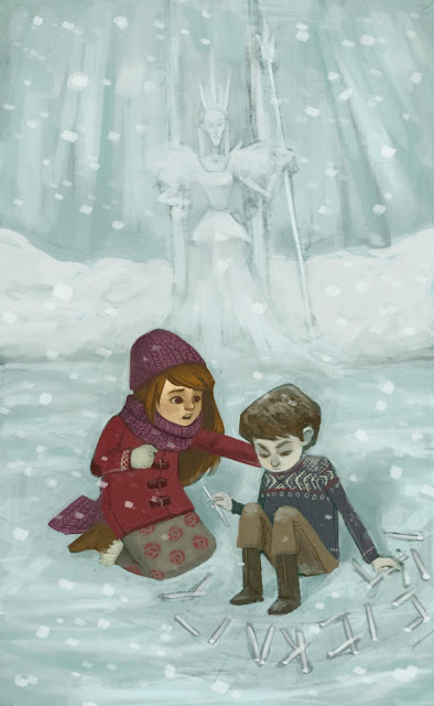
Alyssa Tallent- Assignment 3
I worked on this a little more and fixed some things. Still need to figure out those icicles, though.
Stephanie Leonard - Assignment 3
This is some back-and-forth I did with a client trying to nail down what artistic style they wanted for a kid's scripture iPad app. This was the first image I sent them when they wanted to see a simple children's illustration:
They liked it, but were looking for something simpler, so I gave them these two images:
They liked it, but were looking for something simpler, so I gave them these two images:
But they wanted something even simpler, sort of in the style that a child might draw. So I spent about thirty minutes sketching out these:
And this was the style that they ended up liking.
Ernesto!
This is the fastest turn around I've ever had. 1 1/2 days. Yuck.
But it's done!
And here's the drawing comp of the assignment I was supposed to get to work on, but Mr. Ernesto up there got in the way ;P
It'll get done, I promise!
A lot of vertical things lately... hmmm
Tuesday, February 19, 2013
Sarah Bowthorpe--Project 3: Rapunzel
I had alot of fun with this piece, and I learned alot while doing it. While I've mostly got the values and colors placed where I want them, I don't quite feel like I've got it to the point where I can say I'm finished, so comments and suggestions are welcome.
Monday, February 18, 2013
Rebecca Sorge Project #3 - Ether
Black and white comp:
And here's where I'm at. I'm still working on the values/colors/fish, but I'm pretty happy with the figure. :)
Wednesday, February 13, 2013
I've adjusted some proportions, redrawn and added some things, I've also integrated the new ship. I have three versions here the top one is the one I think I like best. Next I tried making the figures alot bigger, and then even smaller. My initial concept involved the bigness of both the landscape and the ship and I wonder if it loses some of that when the figures are more central.
3X3 Student Show - Call For Entries
Student Show No. 10: Call for Entries
Deadline: March 29, 2013
I think everyone should enter. You never know, this could be your first step into a successful career!
Tuesday, February 12, 2013
Project Three, digital maquette, James Gardner


This is the maquette I made of the ship using Sketchup. Unfortunately I can't find a way to adjust the lighting, that might be a feature not included in the free version. If anyone knows if you can do that and how, let me know. If not, I will use these for perspective and detail and the sculpey maquette as a basis for lighting.
Sunday, February 10, 2013
Project 3 values/drawing, James Gardner
This is a value study that I think represents what I am going for pretty well. I am still planning to do a 3d model of the spaceship in Sketchup to use for reference for perspective etc.
I also did some really quick sculpey maquettes to see about lighting, and I think it will make for some nice reference for the nearby rocks.
Saturday, February 9, 2013
Thursday, February 7, 2013
Tuesday, February 5, 2013
hana's poppy girl - updated version according to the critique given on mon
i made all the changes that were suggested during the critique on monday: darker hair, desaturated skirt, something to be added on the bottom right corner, warmer flower stems, warmer bgd. AND, i do like this better than the first one! thank you for good feedbacks :-)
Subscribe to:
Comments (Atom)


