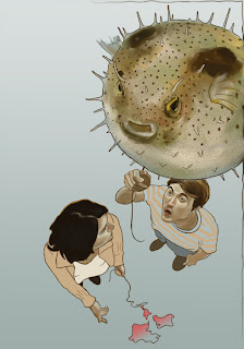
 I played around with a couple different gradients and settled on this one... let me know what you think
Monday, January 30, 2012
Revision
 I played around with a couple different gradients and settled on this one... let me know what you think
Chicago Steppin
Saturday, January 28, 2012
Warmer Accents
Thursday, January 26, 2012
Quick Paint Over
Wednesday, January 25, 2012
Small Changes. Brooke Weber, Project #1
Monday, January 23, 2012
Sketch for the Art Order Project
Sunday, January 22, 2012
Just a tip
Sorry to take up so much space, but I have a tip for you. A friend of mine who is a professional photographer has been posting darling pictures of her baby girl to her blog and Facebook, and recently found out that those images have been used by others (whether for commercial use or not, I'm not sure). Somebody sent her a link (which I saw and snagged) about an artist/blogger who was in a similar situation.
I'm not trying to incite panic, but I thought it'd be helpful to read about how this blogger came up with solutions on how to protect your online images. Watermarks and shrink-wrapping seemed like the best ideas to me-- I plan to try those in the future.
Fair warning, the blog post includes a bit of colorful language, probably because the author is talking about their stuff being stolen. Here's the link:
http://skinnyartist.com/stop-stealing-my-images/
Alrighty, first of all, a disclaimer: I've set a goal for this class that I need to learn how to better use photoshop. So, uh, be kind, as this is my first EVER school project where I use photoshop (and an unfamiliar program) more extensively than just changing the contrast or color in general. This is a version of the cover for the book "The Lion, the Witch, and the Wardrobe." I guess I'll say more about it tomorrow morning.

Subscribe to:
Posts (Atom)


